
Defining The Short Term Trend
A great question came across my desk:
“…as a swing trader (1 – 10 days) I’m looking to buy shares when the market is going up in short bursts and then reverse and go short during the down moves. I would be interested in how to determine when to get in or out of the market…”
The Chartist AU and US Discretionary Portfolios that does exactly that; specifically attempts to ride short term price movements both up and down. The key with the short term movements is to position oneself in the direction of the prevailing market trend, so if you’re trading Australian stocks you may wish to align yourself with the trend of the All Ordinaries Index, or, if you’re trading US stocks you should align yourself with the trend of the S&P 500. Don’t get too caught up in the intricacies of which index to use, it’s more important to align yourself quickly.
If you’ve read Unholy Grails you’ll be familiar with the benefits of using an Index Filter. Simply put we defined the underlying trend of the broader market using a moving average. This concept is nothing new, indeed I was first introduced to it back in the early 90’s after reading PPS Trading System by Curtis Arnold. He defined the trend of individual markets (as opposed to the broader market) by using two moving averages – the 40 day and the 18 day. He would then look for small consolidation patterns and trade on any respective breakout.
Over the years our research has suggested that using moving averages on smaller time frames, such as 1 – 10 days, is not an overly effective method – they tend to lag too much. The market gyrates quickly in this time frame so one can’t afford to allow too much room for the market to move back and forth.
After researching extensively using computerised models and our own experience we found that using a Relative Strength Index (RSI) was significantly more attuned to the bends and twists of short term volatility. Whilst the exact formula for our method is proprietary, we found the RSI on its own was too noisy, so we smoothed it then combined both the raw RSI and the new smoothed version together to define the trend.
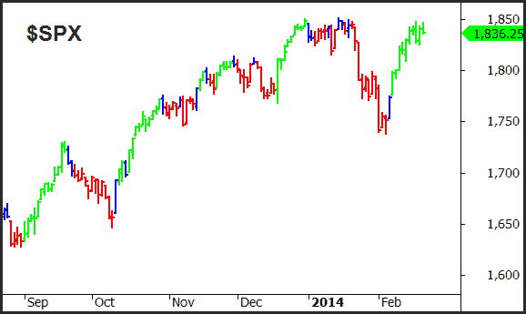
The following chart shows the trend of the $SPX in three phases: green bars when the trend is up, red bars when the trend is down, and blue bars when there is a potential transition from one to the other.
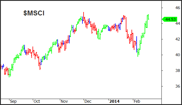
From here we then apply the trend filter to the individual stocks themselves. The next chart shows MSCI Inc ($MSCI) but it should be noted that the colour of the bars is related to the trend of the $SPX and not $MSCI itself. By doing so we can quickly see opportunities aligned with the broader market trend, but we can also see how the individual stock is performing relative to the broader market.
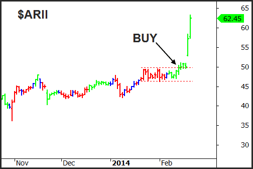
The next step is to combine the trend of the underlying market with one of the 17 setups that we like to trade from our Power Setups® Playbook. Our next chart shows a bullish Darvas Box setup in American Railcar ($ARII). During the construction of the pattern the trend of the $SPX went from bearish to bullish and therefore gave us the green light to take a trade on the long side.
 Short Side Trade
 Short Side Trade
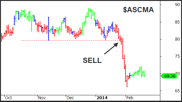
The last chart in this article shows a short side trade that triggers from a break of a horizontal support setup from our Playbook. Ascent Capital Corp ($ASCMA) struggled to break into new high ground forming a double top, but then dived after the trend of the $SPX turned bearish as shown by the red bars. There was ample time to spot the setup and position accordingly.
In our next article we’ll discuss how this same trend filter can help us manage our positions once we’ve entered.