
It’s Different This Time…
Recently, I’ve come across a few articles that highlight a significant shift in the market dynamics over the past 18 months.
Further Thoughts on Sea Change
In “Further Thoughts on Sea Change” authored by Howard Marks, the CEO of the massive fund Oaktree, a thought-provoking perspective is presented, and I find myself in agreement with many, not all, of the points raised. In essence, his key takeaway is that one should not assume that the investment strategies that have been successful since 2009 [or even 1980] will continue to thrive in the coming years.
Strategies Fail When Market Regimes Change
On the other hand, the article “Strategies Fail When Market Regimes Change” seems to be more of a sensationalistic statement. The author appears to have a bias towards mean-reverting strategies rather than momentum-based ones. In discussing this specific momentum strategy, the author concludes, “The strategy’s downfall is attributed to a change in market conditions. The chances of a recovery are slim, and, in the best-case scenario, the equity curve of this strategy will likely remain stagnant.”
Historical US interest rate data
Thanks to Norgate Data, we have access to historical US interest rate data dating back to 1950.
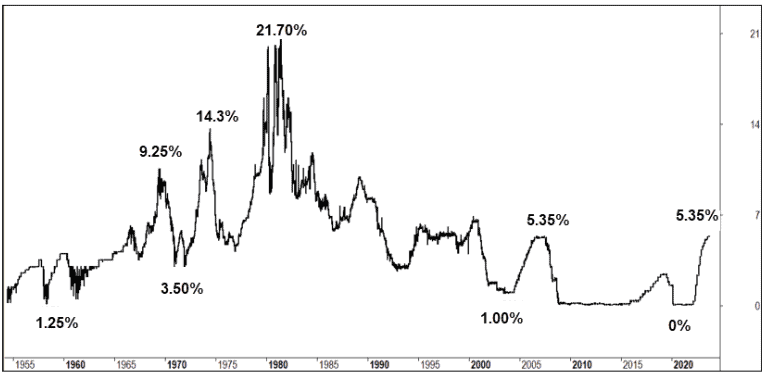
Howard Marks’ discussion of the 40-year decline in interest rates becomes strikingly evident in this chart, as is the stability of interest rates since 2009. Also of interest is the similarity of trends from 2004 to 2007 and those of today.
But whoa…how’s the volatility of rates pre-1980. Those are some significant moves, and the 1958 through 1969 period is worthy of a closer look, namely because its a rapid rise off a low start point, a similar trend to today.
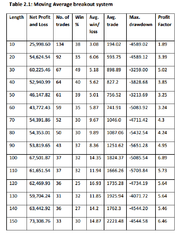
Momentum Strategy
Consider a straightforward momentum strategy, specifically our proprietary US Momentum Strategy, and let’s evaluate its performance before and after 1980. Given the assumption that the ongoing shift in market conditions may affect strategies that have performed strongly over the past four decades, such as equity ownership, it is prudent to test this strategy across periods that could potentially be encountered in the future.
The present-day implementation of the US Momentum Strategy concentrates exclusively on the Russell-1000 universe. It incorporates a Regime Filter to gauge bull or bear markets, measures the momentum of individual symbols, ranks them in comparison to one another, and subsequently acquires the top 10 symbols while exiting those that no longer maintain their ranking within this mechanism.
In this exercise, we will maintain the identical set of rules, but introduce two slight variations: (a) trading the entire US market, including all delisted stocks. This approach eliminates Selection Bias, as historical constituency data is not available going back that far. (b) We will also remove the current liquidity filters. Every other aspect of the strategy will remain consistent.
Test #1
Test #1 covers the period from 1980 through 2023, often referred to as the “Golden Years” of declining interest rates. During this time, the strategy demonstrated an impressive Compound Annual Growth Rate (CAGR) of 22.45%, albeit with a maximum drawdown of 35.8%. The top three drawdowns in this period averaged 29.97%.
Test #2
Moving to Test #2, we explore the era from 1950 through 1980, marked by expansive interest rate volatility and a sustained upward trajectory in rates. Remarkably, the strategy persevered, delivering a CAGR of 23.12%, though still experiencing a maximum drawdown of 28.7%. The top three drawdowns during this time averaged 26.38%.
Equity Growth Chart
I’m not seeing a compelling picture to suggest a rapid increase in rates is going to destroy the strategy. Here’s the equity growth chart for the full period.
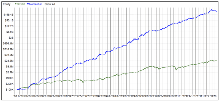
Since this chart employs a logarithmic scale, discerning the fluctuations can be challenging. To gain a clearer perspective, let’s evaluate some additional metrics, starting with historical drawdowns.
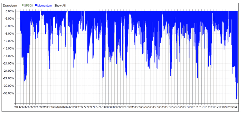
Indeed, the present drawdown is undeniably the most severe, but I’m not entirely convinced that it’s rendering the strategy ineffective. Throughout the entire sample period, we’ve witnessed numerous occurrences of approximately 27% drawdowns.
It’s worth highlighting that among the 80 small-cap funds in Australia, the median drawdown stands at 35.2%^^. Investing truly entails a rollercoaster ride.
Lastly, the following chart illustrates the intervals between equity peaks, which is a pattern we’ve encountered previously.
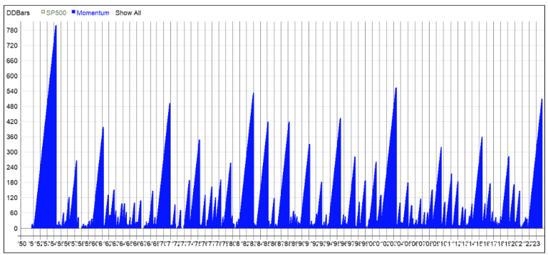
Is it different this time? It’s a possibility. Alternatively, are we merely observing a recurrence of relatively predictable market patterns?
![]()