
Chart Crimes
We’ve all been exposed to chart crimes. Social media, namely FinTwit, probably contains the worst (best?) chart crimes.
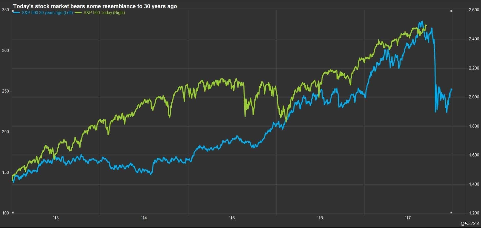
Here is a typical example. In 2017 FactSet Data posted the chart below. The blue line is the 1987 crash. The green line was an overlay of the stock market in 2017, the conclusion (allusion) being that another crash was expected.
Needless to say there was no crash and the market carried on and rallied 15% higher in the following months.
One example I do see a lot by various market commentators is the extrapolation of market events out to a 12-month period to show causation. For example, if XYZ happens then the market is higher 80% of the time a year later.
Is the XYZ event correlated to the market being higher in 12-months? Or does the market just have an upward bias and therefore will be higher a year later regardless?
I took the liberty of picking some random events in the S&P 500 back to 1929 and measured the probability of profit across five holding periods, one week through to one year.
Win Rate per Hold Period
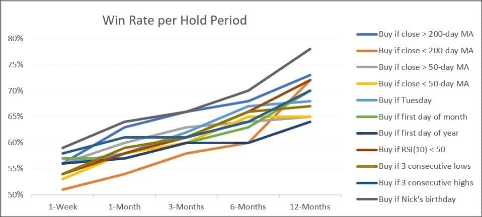
As expected there is a distinct pattern; the longer a position is held the more likely it is to show a profit. Alternatively, the shorter the hold period, the more likely the pattern is random noise.
This is also one reason why we hear typical motherhood statements such as “time IN the market vs timing the market”. As an aside, I disagree with those styled statements, but that’s for another article.
Lastly, one can argue that what I’ve done here is itself a form of chart crime. Picking the US stock market to test the theory is biased to the greatest capitlisation of an economy in modern times. Testing the theory on Japan could yield very different results.
![]()