
Seasonal Patterns in Financial Markets
Seasonality
Seasonal patterns are common within the financial markets and occur for a variety of reasons. They can range from single day patterns to more complex multi-month patterns. Short term traders and long term active investors can add seasonality into their trading plans to create a better risk adjusted return. In this months article I’d like to show you how this can be done.
Seasonal Patterns
There are several common seasonal patterns we hear about. The Santa Claus rally is a common example, which is the markets tendency to show strength into the end of the year. Some argue that this is due to increased confidence leading into Christmas, annual bonuses being paid and therefore invested, or an attempt to beat the January Effect, which in turn is a seasonal pattern itself.
Another longer term seasonal pattern is the Halloween Pattern which is the “sell in May and go away” that is often bantered around. Very short term seasonal patterns include the Turn of the Month (TOTM) which is the markets propensity to show strength into the last week of the month and follow through into the first week of the new month. Even the first trading day of each new month tends to show a unique ability to always be strong. Some argue that it’s because this is the time where fund inflows are invested.
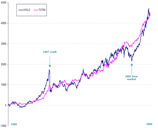
Let’s take a closer look at some of these and see exactly how they may be able to help. The following chart is the All Ordinaries Index (XAO) since 1980 in Blue representative of a Buy & Hold approach, and the TOTM overlaid in Magenta. To compute the TOTM I asked the computer to buy 1-week prior to the end of the month, and exit at the end of the first week in the new month. On first glance you may not notice a great deal of difference. They more or less finish up at the same level providing a similar return. Stand out points of time are the 1987 crash and the 2002 bear market. The recent bull market has also been a standout event – the Buy & Holders have certainly rallied back very fast.
TOTM curve
Notice however, how the TOTM curve is a lot less volatile than the Buy & Hold approach. Making an absolute return is one thing and is usually the only thing many retain investors consider. But what about the journey in making that return? Those of you that were not around in 1987 may not remember that the market fell 50% literally overnight. Imagine waking up tomorrow morning with BHP back at $14.00 and CBA sub-$20.00? So even though the Buy and Holders have played catch up, the journey itself can be rough. If you are unable to travel the journey, then there is no chance of reaping the rewards. When discussing the journey we talk in terms of “risk-adjusted returns”.
Let me show you just how different the two journeys here actually are. This following chart is known as an Underwater Equity Curve. It plots the size of the troughs between market peaks so it essentially plots the level of pain. The deeper the trough, the more the pain, the harder the journey.
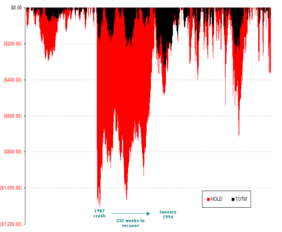
The Red curve shows the Buy and Hold troughs in points.
You can see that in 1987, the trough was just over 1000-points in depth. The other major trough to the right is the 2002 bear market. Notice however that the TOTM curve is a lot less volatile. In other words by buying only into the week leading up to the end of the month, then exiting after the first week of the new month, we have managed to retain the same return but dramatically decreased the pain associated with staying in the market 100% of the time.
The other overlooked issue when discussing investment returns is the time it takes to get back into new equity highs. This is known as “time to recover”. Ideally we’d like our account to be making new equity highs whenever possible, but if we suffer a major peak to trough decline it may take a long period to recover. After 1987 it took 332 weeks to make a new equity high again. That’s weeks, not days! It wasn’t until January 2004, some 6-years later, that investors who had bought the top in 1987 started to show some profits. The TOTM only took 39 weeks to recover during 1987 – simply because it was not involved in the crash itself. The largest time to recover using the TOTM method was during the 1994 to 1996 bear market at which time it took 132 weeks to claw back its losses.
What about the strongest and weakest months or the year?
December is the strongest month of the year, hence the Santa Clause theory. December has been positive in 20 of the last 26-years, some 77% of the time. Even when December was negative, it was less than ½ the loss than the average gain. The second strongest month of the year is in fact April with a 77% chance of an up month occurring.
What about the January effect?
January is actually equal 6th, showing just 14 positive closes out of the last 26years. The weakest month? October you say? Well, in terms of net points won or lost yes, but that’s because of the 1987 aberration. The weakest month in terms up verse down periods is in fact June. June has been a negative month on 17 occasions over the last 26-years, with only 34% of Junes since 1980 being positive. Perhaps tax selling does have a large impact on the market?
If you wanted to limit your activity to one buy and one sell per year, which months are best to hold? Well, you can buy on November 1st and sell on July 31st for an 84% chance of having a positive gain. Also ranking at 84% is buying on May 1st and selling on March 31st, although net profitability declines by some 30% during this period.
So there you go. If you decided that you wanted to take 3-months off during the year, then it might be best to take August, September and October off and come back ready to invest again in November.
![]()